Blog

LUCY MORENO

LUCY MORENO

Originally from Colombia,South America,lived in Antwerp for 9 years after finishing a MA in Sculpture. She has been living between Antwerp, Brussels, London and Bogota. Worked as a set designer with many fashion photographers and helped at least half of the fashion students in Antwerp with their collections.Lucy is also a regular contributor in Dazed Digital ,Hint magazine,Soho, and other publications.
http://thefabulouslifeoflucymoreno.blogspot.com/
twitter.com/LucyMoreno

DESIGNERS AGAINST AIDS

Hello friends

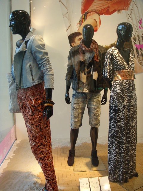
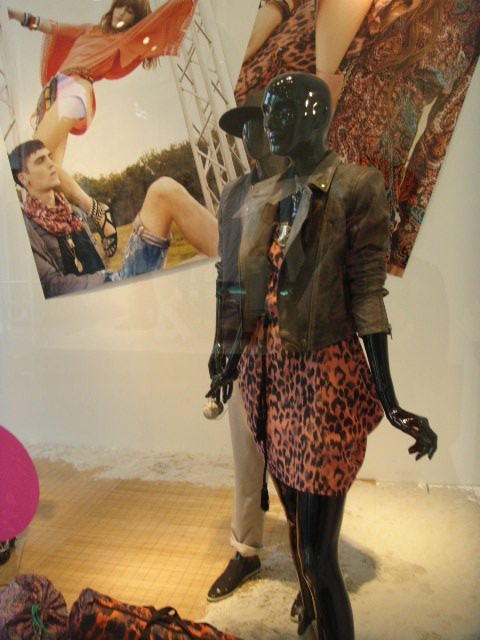
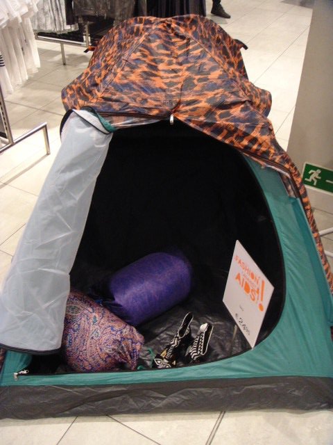
i would like to invite all of you to visit this site and also to buy this beautifull collection on sale at H&M,as 25% of the profit will go to suport ths organization and create awarness about HIV.

DAA is always looking for people and now Ninette from DAA ,who also use to be a fashion journalist told me that their  education center is in  june 25th (next friday)   looking for workshop students, also from Japan, first course  (6-8 weeks long) is in april 2011 and students have to be able to speak  and write english very well, be interested in pop culture and in HIV  prevention campaigns.

This is  also an interesting story in the Japan times about an art project on show there (pieces auctioned benefit DAA),i didnt find where ,but sure you can also read it in Japanese!

http://search.japantimes.co.jp/cgi-bin/fs20100617a4.html

http://www.designersagainstaids.com/

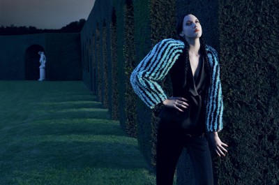
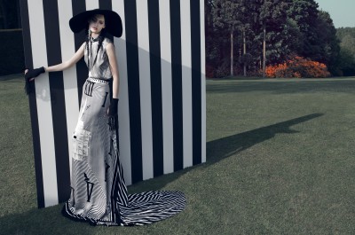
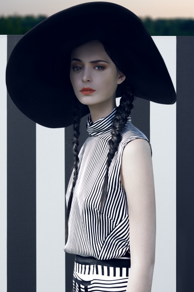
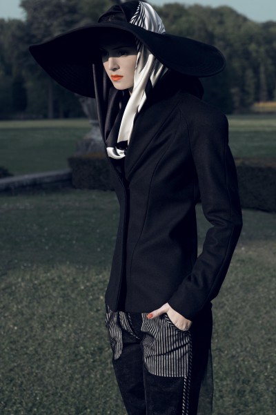
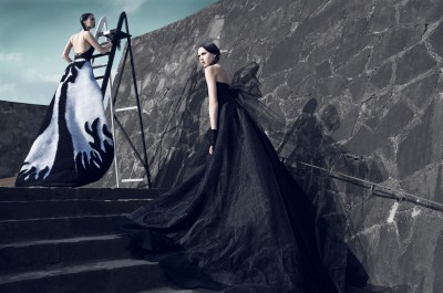
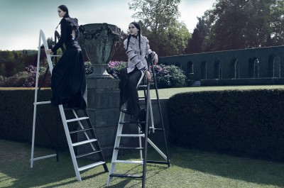
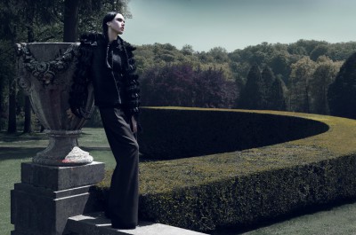
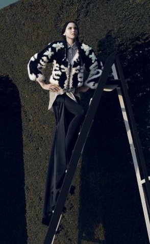
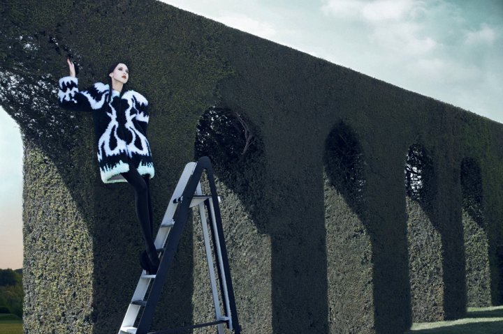
the photos are from the H&M shop at the end of the Meir in Antwerp!
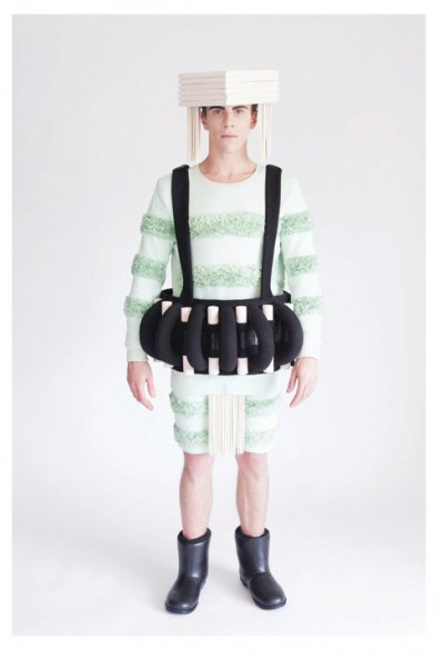
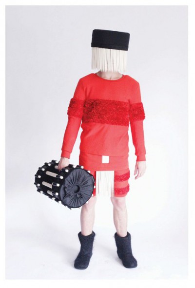
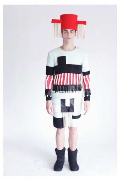
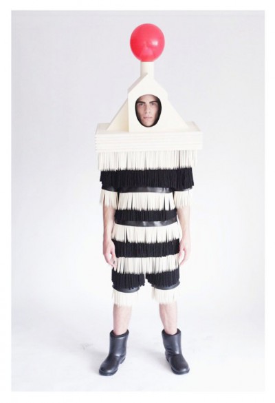
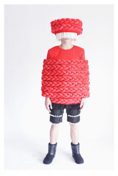
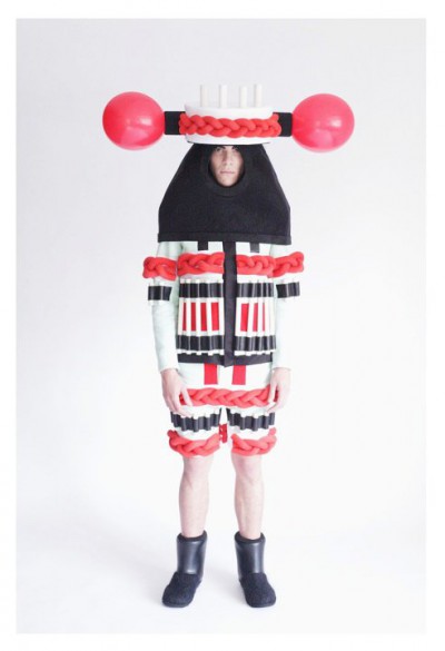
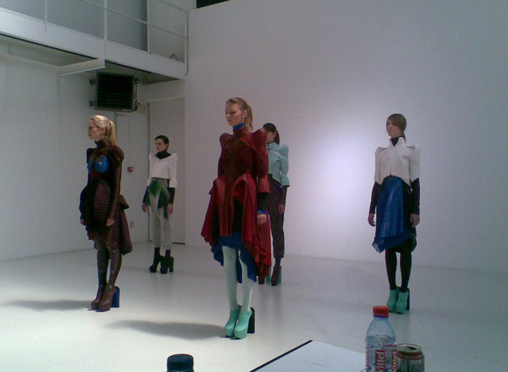
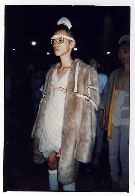
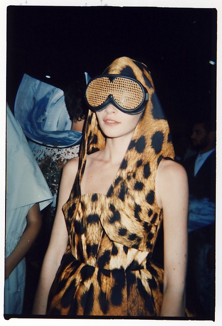
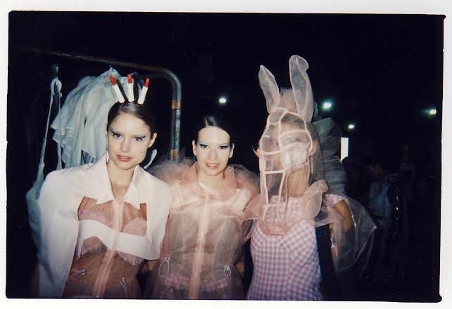
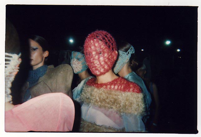
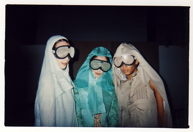
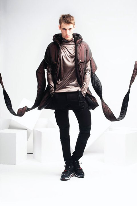
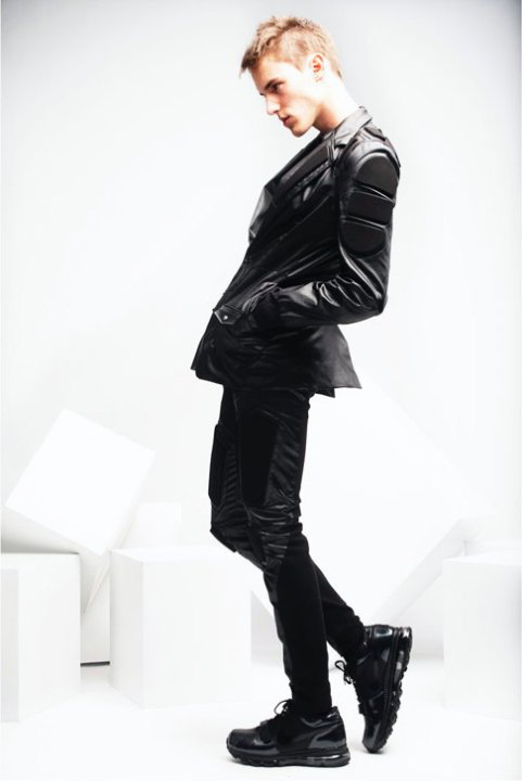
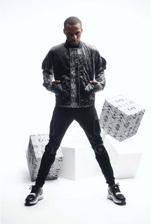
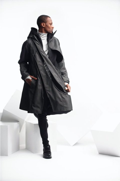
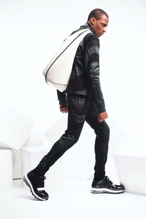
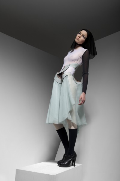
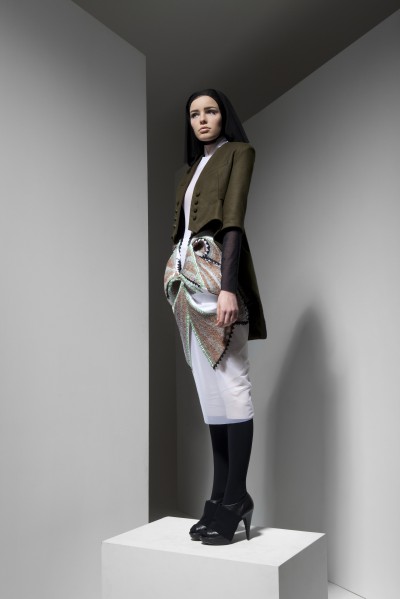
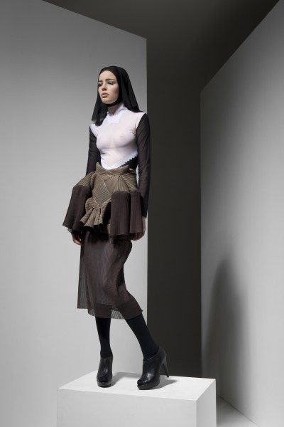
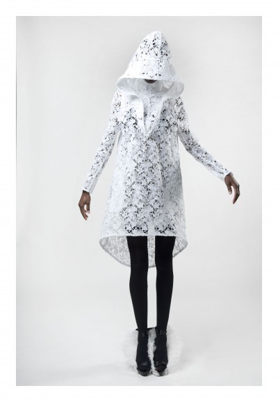
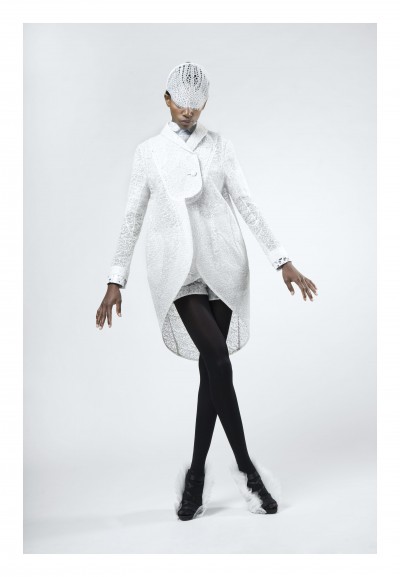
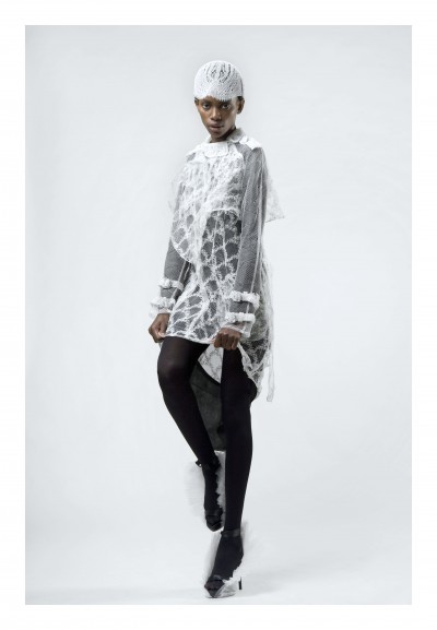
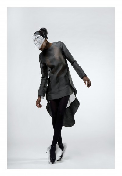
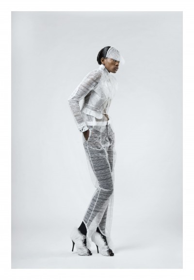
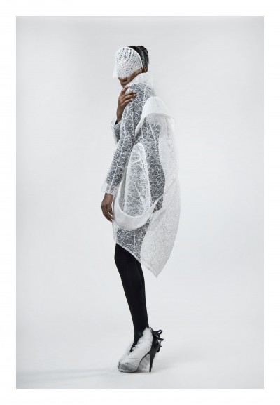
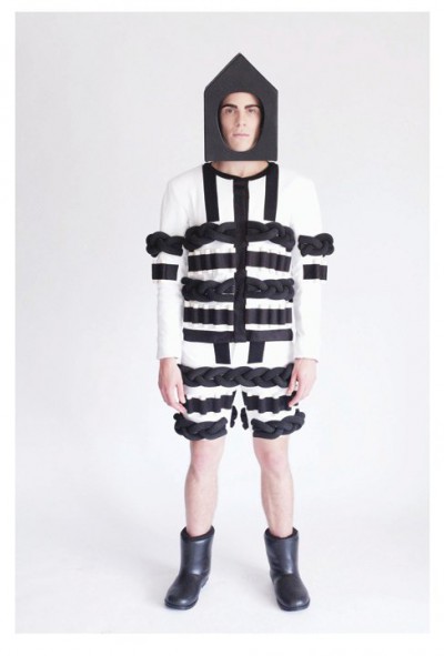
Central Saint Martins === Craig Green

 Craig Green presented his BA collection at the Central Saint Martins show few weeks ago,i think he is also one of my favorties there,I  also had the chance to meet Craig in Antwerp when he was doing his internship at Walter Van Beirendonk ,who is also one of his favourite designers.He is as much fun as his clothes are.Now he is aplaying for MA in fashion and i can’t wait to see more from him!

ANTWERP ACADEMY////TERUMASA NAKAJIMA////


Inspired by the french novel “La Dame aux camelias” which is a love story of prostitute.
I was so impressed the heroine’s way to live as a girl.
It was so sophisticated, elegant, independent and pure.
On the other hand, it was also about a prejudice.
At the same time, i was interested in the artwork of Lee Bontecou which is mixed an organic and a technology.
To express the feeling,
i tried to combine them together and use lace as a classic and make it modern, sharp, active and strong mixing with a line from industrial design like car, ship and space ship and art deco as a technology to show a differnet impression which we have in general.
Also i treated a lace stiff by a resin and tried to make a volume with it.

Teruma who is in the 3rd year won the Academy most wanted prizes like the Louis award and the  Christine Mathys award who was co-founder of NV Dries Van Noten.

YOOLHEE KO by zeb daemen

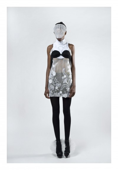
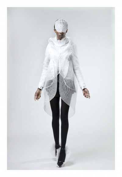
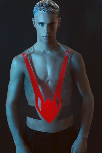
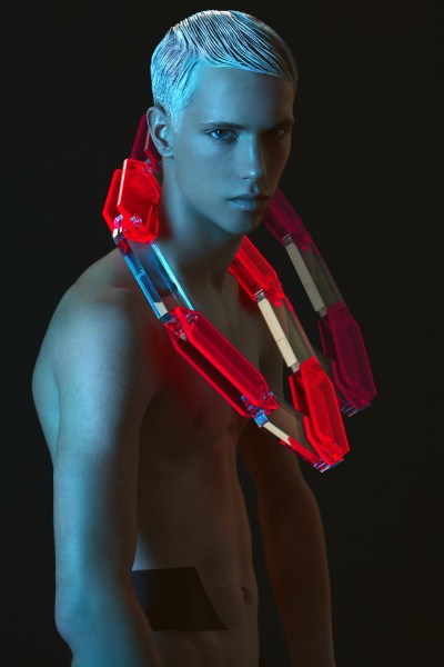
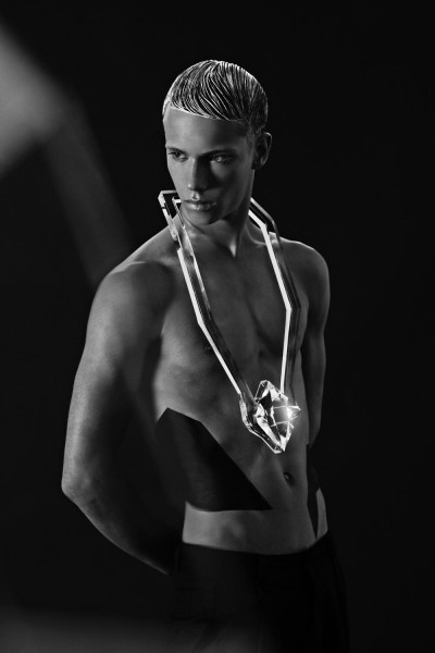
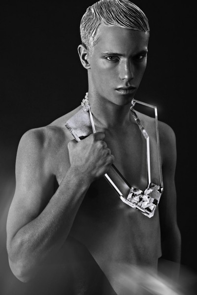
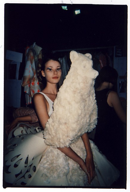
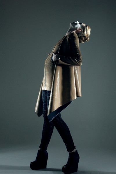
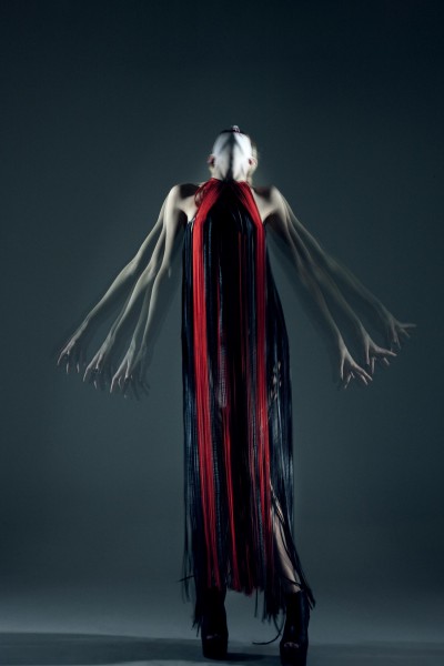
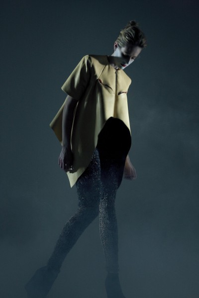
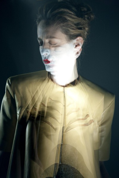
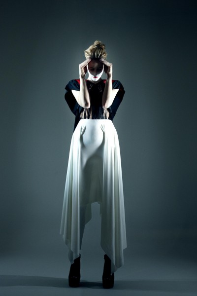
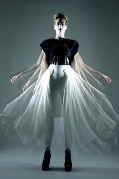
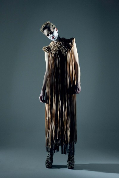
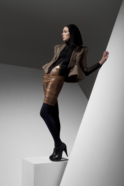
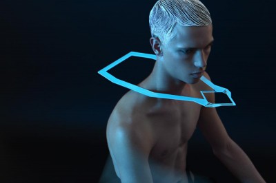
Well ,as you can see I am a huge fan of her work,i really love the photoshoots they did with her work and i wanted to share with you this photos as well,because this is the actual pesentation of her graduation project ,I have to say that i love that she used new materials like Perspex ,is nice that someone is working with not so traditional materials like silver and gold ,i mean is 2010 time to experiment.

If u want to contac her    

koyoul@hotmail.com

YOOLHEE KO by Frederik Heyman

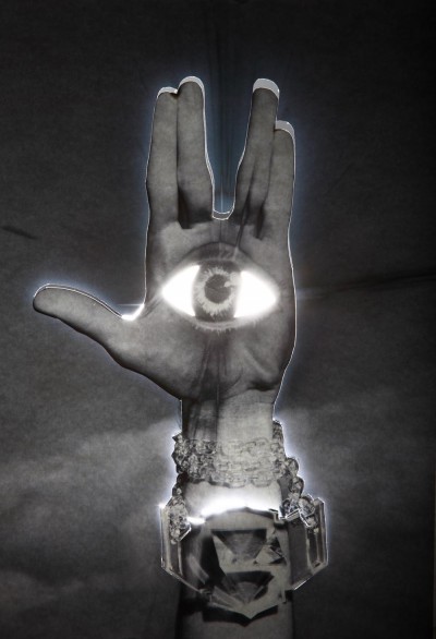
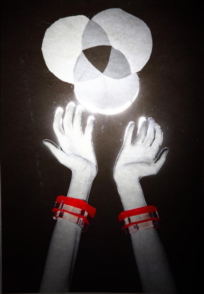
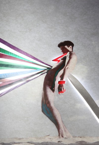
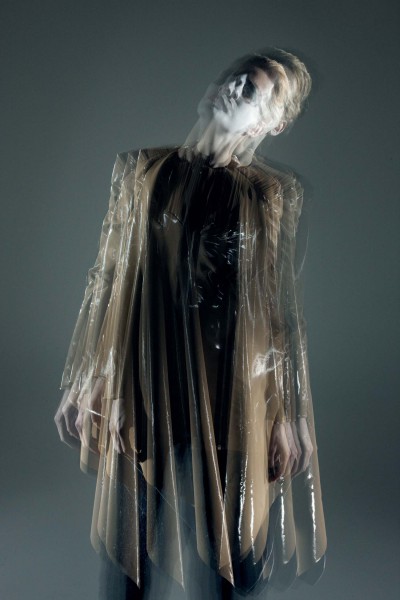
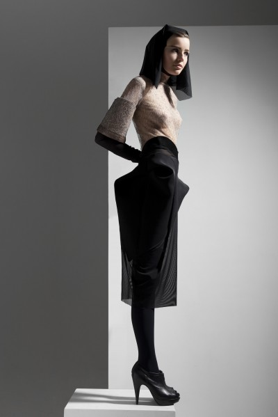
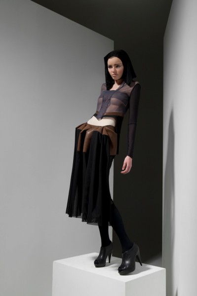
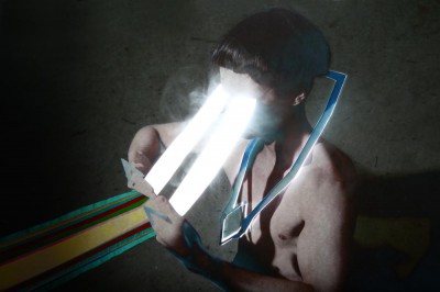
I am happy to introduce you to one of my  most talented friends ,she is Yoolee ko,she is from Seoul but lives in Antwerp,she graduated one year ago from Jewelry and now she building her own company and studying to be a master in diamonds!!! This photos are made by Frederik Heyman another Antwerp  graduate and an a kick ass photographer!

RAF SIMONS ,LOST IN TIME BY PIERRE DEBUSSCHERE

RAF SIMONS LOST IN TIME from pierre debusschere on Vimeo.

RAF SIMONS LOST IN TIME
Vogue homme japan
raf simons
pierre debusschere
matthieu blazy
marieke van dongen
william eustache

LA CAMBRE 3 / Lucas Sponchiado

I really love his collection,and the shoes are like major.I know Lucas since many years and i am happy to present him to you ! apart of being an amazig designer he is also an amazing person ,in love with ice tea and milk!
what’s the concept behind your collection?
This year I have taken my inspiration from a woman of legend, a fairy tale and have worked on the confrontation with an image, the representation of a certain idea of good and evil.

This decision was inspired by Francis Ford Coppolas “Dracula”, which encouraged me to investigate the historical aspects of the subject, and of course my own imagination.

My imagination crystalised around the inspiring work of contemporary artists such as Le Moult, Jeff Van Tuerenhout, … These artists unveiled an imaginary world where a mysterious and powerful woman emerges

The vision of this powerful woman-creature inspired a certain replication of a certain anotomical construction expressed in the cut of the clothes, the way the fabric is rendered, the use of pleats, stiff structures, shoulder pads, bindings.. The anatomical inspiration, revealing skeletal structures, muscles and veins of the human body and imitation as pieces of armour or a carapace.

What plans you have for the future?

First i think i’m gonna do my fifth year at La Cambre. After that i would like to work for “maison de couture” to learn in the professional field ,to understand financial and commercial dimension in fashion to maybe one day start my own label.

Why womenswear?

Last year i did a menswear collection. it was interesting and make me understood that womenswear was more accurate to me.

How old are you/where are you from?

I am 22 years old.I am Italo-Belgian.I always lived in Brussels.

ANTWERP SHOW //// backstage hotness////


I will upload some more photos tomorrow !!!!

Walter Van Beirendonk,Terumasa Nakayima,1st year skirt,Niels Peerader,Mariel Manuel,Kenta Kodarai,Paula Selby Avellaneda,Terumasa Nakayima,Maria Girelli,Kenta Kodarai

Photography OTTO VANKERKHOVE

http://ottovankerkhove.blogspot.com/

LA CAMBRE 2/ Oriane Leclerq


FAKE IS JUST AS GOOD

If there’s an artist whose work is at the origin of this collection, it is undoubtfully the American painter-photographer Boo Ritson and her intimidating pictures of thickly painted bodies. Instead of structuring and modelling the body, Ritson’s artistic intervention involves liquid pigments dripping on the skin of her models, turning them into flabby, somnolent and yet colourful and scandalous body shapes. Now to create her living sculptures, Ritson focuses exclusively on the (epidermal, photographic) surface of various bodies which, in return, offer their own shapes and volume to the artist’s material creations. The project I am submitting here is a response to Ritson’s essential focus on the surface and its confrontation with the human body.

So here is the surface; there is the body; now let the two entities meet! Because it is pure shape, the body imprints; it emerges slowly from the smooth surface, gives an ephemeral shape to the adaptive piece of fabric, and then disappears. Purity and simplicity are the words.

More than a simple citation of Ritson’s work, my project also echoes the parallel obsession of Pop Art with flat painting and mimetic plastic reproductions of everyday objects and bodies. Boo Ritson’s work itself isn’t devoid of a general “plastic” feeling. But behind the diverse artistic approaches lies the same critique of the modern tendency to seek perfection – or perfected versions of ourselves – in extreme aestheticization practices often leading to horrifying results: plastic faces, fake bodies, the production of identically perfect objects, polished surfaces rejecting any imperfection. But since imperfections are human, aesthetic perfection becomes somehow inhuman. And almost inhuman will indeed look the silicon masks included in my collection. Aestheticized replicas of each model’s face, they illustrate the repeated will to stand out and the lost of identity, a certain form of depersonalization (the 8 identical pairs of boots and glasses also worn by the models will serve the same purpose). Furthermore, the unavoidable disappointment and frustration caused by this extravagant quest for beauty and perfection will also be given a material form in the collection, through the transformation of matter itself and its movement from solid to liquid, from hard to mellow, from shell to cloth.

At last, not a stranger to the Pop Art world, Kim Gordon (the frontwoman of arty New-York band Sonic Youth (cf attached file)) is the inspiring muse of this project. Encouraged by the musician’s punk attitude, the collection will dare strong contrasts of fabrics and colours and won’t hesitate to use leopard prints. A raw carnal energy will anchor the collection to the ground and hopefully help to prevent the dangers of a too conceptual approach. 

Future plans….
 I want to work (of course!) in big houses, i hope for an intership at margiela. 
About the fabrics                                                                                                                                                                            I used a lot of synthetic fabrics: mostely lycras and neoprene.

Photography Pierre Debusschere

Antwerp Academy 2 / Tomohiro Tokita


 my collection
My collection inspiration came from special visual effect
which is used for the SF movies. Thats why my collection
title is “Sci-Fi”
To express Sci-Fi, I tired to use special zips which were
used last year collection just used for the detail
decoration. I used zips which goes around the sleeve and
body. If you open the zips, sleeve and body disappear the
shape as it is. Even open zips, sleeve and body parts
disappear, it can be worn by wrapping. I tried to think
about that clothing can be worn both closed zip and opened
zips.  This year, I tired to use zips more wearable way
and more function way.

material I used
I used lot of synthetic fabric this year and I used
sponges for the protection parts.

plans future
I don`t know yet…. But I want to work!!!!!!

Why mens wear
I tried to make woman wear before, but it didn`t go
well…. Thats why!
contact at         t_tomo79@yahoo.co.jp                                                                                                                                   
photography         Soonhyun                                                                                                                       

ANTWERP ACADEMY 1 – Toon Geboers


I am in love with this collection from the MA fashion at the Antwerp Academy ,probably  because i am a huge fan of the Adams Family…But also is impecable done.

Zeb Daemen is also a fresh and new photographer from Antwerp,already making himself a name in a city that is known also for the fashion photographers.

Can you enlighten us about your graduate collection? What was your main inspiration?             

It’s very much inspired by The Addams Family, the dark, ironic yet humoristic movie from 1991 with Christina Ricci and Angelica Huston. The pieces are inspired by the Addams characters and the whole atmosphere of the movie.   I really got intrigued by the long silhouettes from Morticia Addams especially the stripes… In addition to the subject I worked closely with a textile museum from Tilburg, Holland. They are specialized in a technique called ‘tufting’ which basically is a technique used to create long hairy rugs in wool. 

However, my favorite material to work with is actually tulle, so I incorporated that instead of the wool. Small elements from carpets, rags and worn out elements are blended in little details in the jackets and skirts. Where tufting with wool is ancient technique, tufting with tulle is new one. 1 cm cut-out cloths were hand-rolled and implicated in the design. I kept the patterns of the skirts modest. By combining classic and contemporary patterns this resulted in the skirts having a more modern character. 

Of course I had to implicate some humour, which can be find nicely hidden in the tulle with graphic prints from carnivore plants and dinosaur heads. 

‘WEDNESDAY’ 4th year master collection-by Toon Geboers,Photographed by Zeb Daemen

LA CAMBRE 1 – Lea Peckre

La Cambre in Brussels – Belgium doesnt make as much noise as the Antwerp Academy ,but in the past years some younger designers are giving the school a new prespective,Lea is one of them after being an intern at Jean Paul Gaultier she came back to finish her studies and amaze us once again with her beyond beautiful collection!

whats the concept behid the collection

I was  inspirered by cemetaries , not macabre, no religious place but rather its environment, its chaos and it ‘ s outdated look  that sometimes seem lost in the midst of megalopolises…

Therefore, cemetery elements such as graves ( stones & monuments), woods, surrounding trees, creeping vegetation  and wrought iron drawing contrasts in the landscape.

Also, handling light has become an obsession for me… thinking back at the light of a cemetery, it’ s reminds the light of a Caravaggio masterpiece.

 wich fabrics u use

 These are thick fabrics, mated woollen, flesh split velvet, woven with a structure close to wood, in earth range of colours, from brown to white, and deep dark black to vert-de-gris and charcoal grey.

Leading to the wood, I designed my own sequins in printed forms of 7 differents wood species, reminding how platelets would be for intarsia.

 what plans u have in the future

 I am looking  for  work  in a «  maison de couture « .

 wich is your favorite designer

Lot of respect for the work of Olivier theyskens and Muccia Prada !!!!!  

contact Lea at +32 4 93 16 19 45  Belgium   +33 6 67 69 35 27 France   l.peckre@gmail.com